Website navigation mistakes can cost you customers by making it harder for visitors to find information, trust your business, or take the next step. A confusing menu can turn an interested visitor into someone who simply leaves.
Good website navigation should make every important page easy to find and every action easy to understand. This matters even more for service businesses, where visitors may be comparing providers, reviewing services, looking at past work, and deciding whether to request a consultation. From menu labels to mobile navigation, small UX problems can create unnecessary friction throughout the customer journey.
Why Website Navigation Matters for Conversions
Website navigation is the system that helps visitors move from one page to another. It typically includes the main menu, dropdowns, links within content, calls to action, and other pathways that guide users around a site.
When navigation is clear, visitors can quickly answer important questions: What does this company offer? Can I see examples of its work? How do I contact the business? Where can I learn more?
That clarity directly supports website conversion optimization. A visitor should not have to think about how your website works before they can decide whether your business is right for them.
For example, someone looking for a remodeling website designer may want to move from a service page to a portfolio, then to an about page, and finally to a contact form. If those paths are obvious, the website supports the buying process instead of interrupting it.
Website Navigation Mistakes That Drive Customers Away
Poor website navigation often comes from small design decisions that seem harmless individually but create a frustrating experience when combined.
Too Many Navigation Links and Choices
A crowded navigation menu can overwhelm visitors. When every possible page receives equal attention, users may struggle to determine which options actually matter.
This is especially common when businesses place numerous services, resources, company pages, and secondary links directly in the main menu.
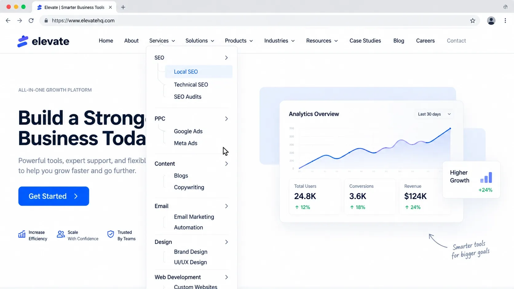
Effective website navigation design gives priority to the pages visitors are most likely to need. Less important destinations can remain accessible through the footer, contextual links, or carefully organized dropdowns.
The goal is not to hide information. It is to organize it so visitors can make decisions without unnecessary cognitive load.
Confusing or Unclear Menu Labels
Navigation labels should tell visitors exactly what they will find after clicking.
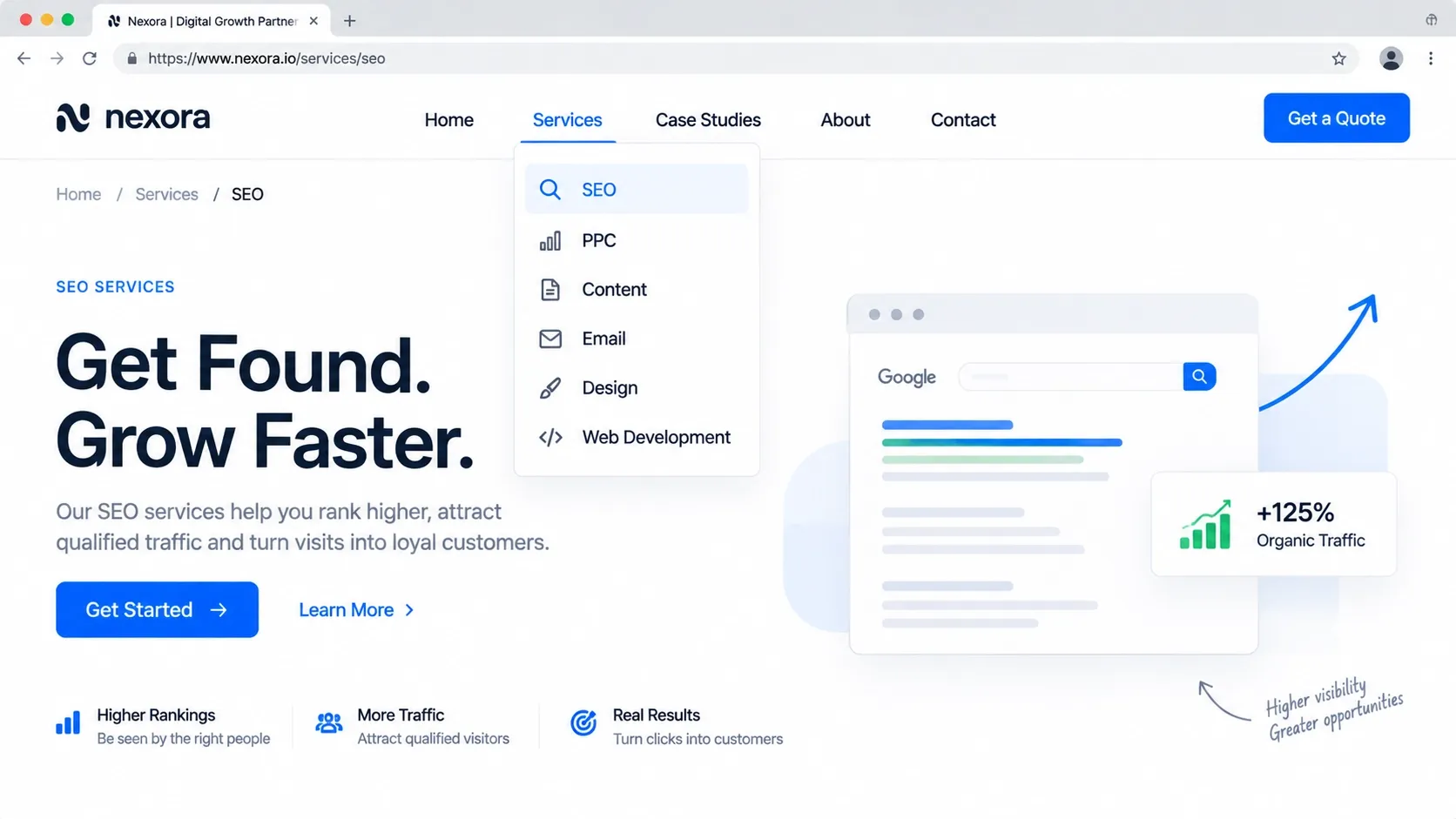
Labels such as "Solutions," "Explore," or "Resources" may sound polished, but they can be vague when the visitor does not know what they contain. A service business will usually benefit from straightforward labels such as "Services," "Projects," "About," and "Contact."
Clear labels also help search engines understand the relationship between important pages. Your navigation should use language that matches how your audience naturally thinks about your products or services.
Hiding Important Pages in the Navigation
Important pages should not be buried several clicks deep without a good reason.
If visitors need to search through multiple dropdowns to find your services, portfolio, pricing information, or contact options, the structure is creating friction.
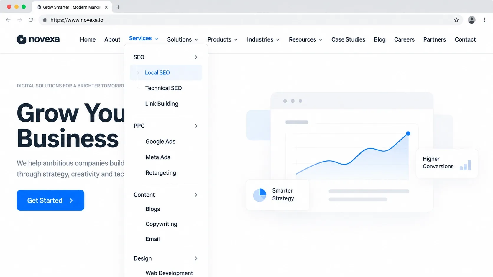
Consider which pages support the customer's decision and make those destinations easy to reach. For businesses with several offerings, a logical service structure can make a major difference. For example, related services can be grouped under a clear parent category instead of competing for space as separate top-level links.
Making Visitors Hunt for Contact Information
A customer who is ready to contact you should not have to search for a phone number, form, or consultation option.
Keep contact information easy to locate from the main navigation and reinforce the next step with relevant calls to action throughout the site. The wording should also make the action clear, whether that means "Request a Consultation," "Get Started," or another phrase that accurately reflects the process.
Using Dropdown Menus That Are Difficult to Use
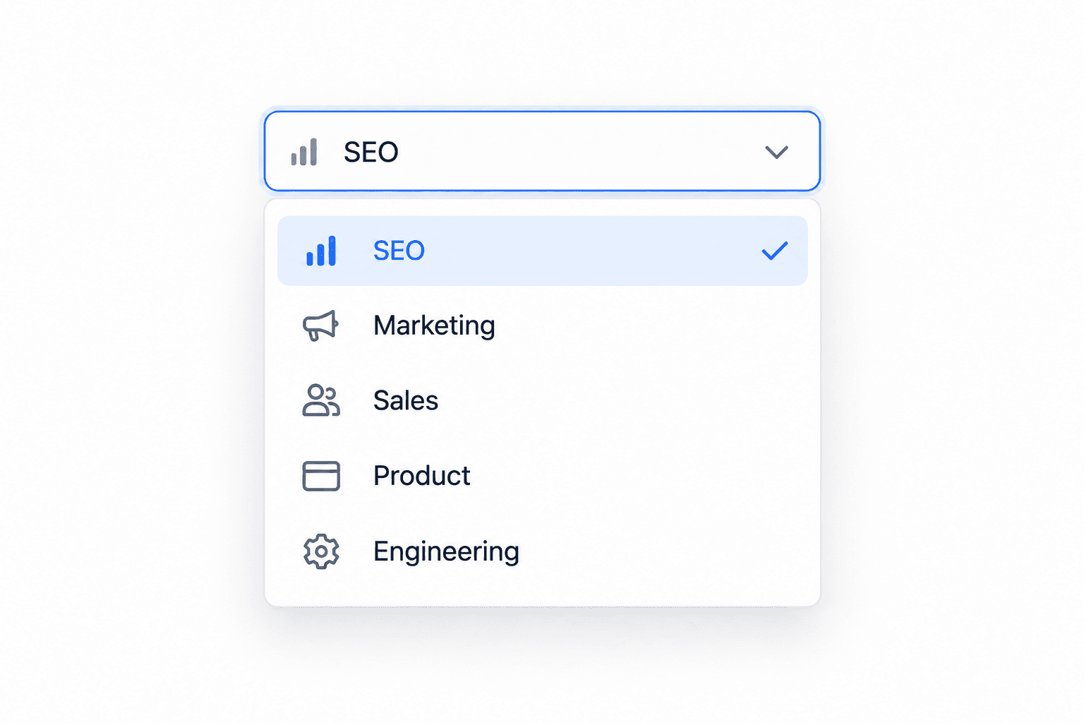
Dropdown menus can organize complex websites, but they can also become frustrating when they contain too many options or require precise mouse movements.
A dropdown should help users narrow their choices, not create another maze. Keep categories logical, use readable labels, and avoid deeply nested menus whenever possible.
Ignoring Mobile Navigation
A navigation menu that works well on a desktop can become difficult to use on a phone. Small tap targets, oversized menus, hidden links, and awkward dropdown behavior can quickly frustrate mobile visitors.
Mobile website navigation should be designed around touch interaction and smaller screens. Menus should be easy to open, scan, close, and use with one hand.
A mobile-first approach also encourages designers to prioritize the most important content instead of simply shrinking a desktop menu. This is particularly important for businesses that rely on visitors contacting them from mobile devices.
Creating Inconsistent Navigation Across Pages
Visitors should not have to relearn your website every time they open a new page.
Changing menu positions, labels, button styles, or navigation behavior from one page to another creates uncertainty. Consistent navigation makes the site feel more predictable and professional.
Consistency does not mean every page must look identical. It means the core navigation system should behave in a familiar way throughout the website.
Failing to Show Visitors Where They Are
Visitors can become disoriented when a website contains many pages or categories but provides no clear sense of location.
Visual cues such as highlighted menu items, descriptive page titles, breadcrumbs where appropriate, and logical page structures help users understand where they are and where they can go next.
This becomes particularly useful on large service websites, e-commerce sites, and sites with multiple content categories.
How Poor Navigation Affects SEO and User Experience
Poor website navigation affects more than usability. It can also make important pages harder for search engines to discover and make it more difficult for visitors to engage with your content.
- Website crawlability: Clear internal navigation gives search engines additional pathways to discover and understand pages across your site. A poorly organized structure can make important content less accessible.
- Visitor engagement: Confusing navigation can cause visitors to abandon a page before finding the information they need. Clear pathways encourage users to explore relevant services, projects, and supporting content.
- Local search visibility: For local businesses, navigation can help organize location-specific and service-specific information so both visitors and search engines can understand what the business offers and where it operates.
Navigation should therefore be treated as part of both website usability and SEO strategy, rather than as a purely visual element.
How to Create a Website Navigation That Converts
Effective navigation does not simply help people move between pages. It helps them move toward the information and actions that matter.
Prioritize Your Most Important Pages
Start by identifying the pages that matter most to visitors and to your business.
For many service businesses, these may include:
- Core services
- Project or portfolio pages
- About information
- Contact or consultation pages
- Important resources
Not every page needs a place in the primary navigation. Prioritization keeps the menu focused while allowing secondary content to remain accessible elsewhere.
Use Simple, Descriptive Menu Labels
Use labels that visitors understand immediately. Avoid clever wording when a familiar term communicates the purpose more clearly.
Good navigation menu best practices are simple: describe the destination accurately, keep labels concise, and use consistent terminology throughout the website.
Your labels should also align with the language used in your page content. This creates a more coherent website experience and helps visitors understand the site's overall structure.
Build a Clear Path to Contact or Conversion
Navigation should support the action you want qualified visitors to take.
If your goal is to generate leads, make the contact path obvious without forcing every visitor into a sales funnel. Someone researching your services may need several visits before contacting you, so provide useful paths to supporting information along the way.
A well-placed CTA can work alongside the main menu without overwhelming it. The result should feel like helpful guidance rather than pressure.
Design Navigation for Mobile Users
Review your navigation on actual mobile screen sizes, not only in a desktop browser.
Check whether visitors can easily tap menu items, distinguish categories, return to previous choices, and reach important pages. Also make sure the menu does not cover essential content or create unnecessary scrolling.
Mobile-first web design is especially useful when planning navigation because it forces important content and actions to receive clear priority.
Keep Navigation Consistent and Predictable
Once you establish a navigation system, use it consistently.
Keep the primary menu in a familiar location, maintain stable labels, and make interactive elements behave as visitors expect. Predictability reduces the amount of mental effort required to use the site.
For broader UX improvements, navigation should also work together with typography, spacing, visual hierarchy, and page layout rather than being designed in isolation.
How to Audit Your Website Navigation
A navigation audit does not require complicated software to uncover obvious problems. Start by approaching the website as a first-time visitor.
Try completing common tasks without using the browser's search function. Can you find the main service, view relevant work, learn about the company, and locate the contact option without guessing?
Then test the same paths on a phone. Pay attention to moments when you hesitate, backtrack, open the wrong menu, or wonder what a label means. Those moments reveal opportunities to improve website navigation.
It is also useful to review your analytics for pages with high exit rates or weak engagement, but analytics should be combined with actual usability testing. Numbers can identify where a problem may exist; observing how people use the website can help explain why.
A useful audit should consider:
- Whether the most important pages are easy to reach
- Whether menu labels are immediately understandable
- Whether the navigation works smoothly on mobile
- Whether dropdowns are organized logically
- Whether contact and conversion paths are obvious
- Whether navigation remains consistent across pages
- Whether important pages have clear internal pathways
If several of these areas are difficult to complete, the problem may be larger than the menu itself. The site's overall information architecture or website design may need attention.
Conclusion
Website navigation mistakes often create problems before visitors ever evaluate your actual services. A crowded menu, unclear labels, difficult mobile controls, or hidden contact path can make a capable business appear harder to work with.
The best website navigation is simple, predictable, and focused on what visitors need next. Prioritize important pages, use familiar labels, build clear conversion paths, and test the experience across desktop and mobile devices.
For businesses that depend on their website to generate leads, navigation should be considered a core part of the website's conversion strategy—not an afterthought. A thoughtful structure can make it easier for the right visitors to find information, understand your value, and take the next step.
When the existing structure no longer supports those goals, a professional website design and development approach can help bring navigation, UX, and business objectives back into alignment.
Share this article