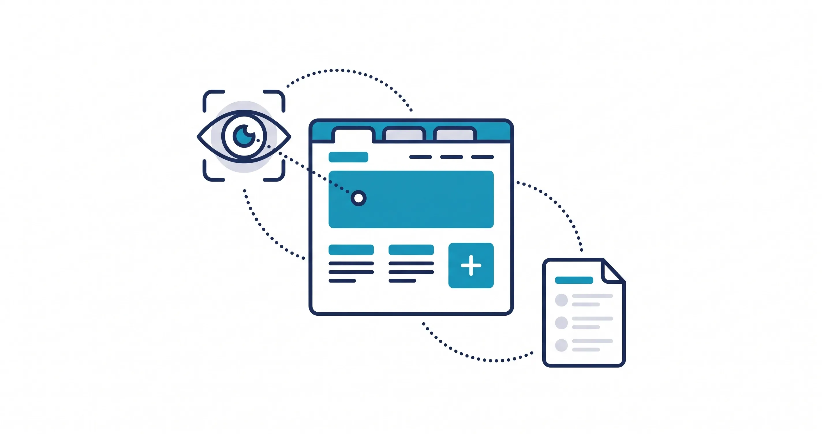
White space in web design can improve conversions by making pages easier to understand, reducing clutter, and directing attention toward important actions. It gives content room to breathe and helps visitors move through a page naturally.
A conversion-focused website should not force visitors to work hard to find information. Good spacing creates clear sections, improves readability, and makes important elements such as calls to action easier to notice. When used with strong content, navigation, and visual hierarchy, white space can make the entire website experience more effective.
What Is White Space in Web Design?
White space is the empty area between elements on a webpage. It can appear around headings, paragraphs, images, buttons, forms, navigation items, and larger content sections.
The space does not have to be white. It can use any background color or visual treatment. The important part is that the area provides separation between elements.
There are two main types of white space:
- Macro white space: Larger gaps between sections and major content blocks.
- Micro white space: Smaller spacing between related elements such as text, buttons, and images.
Both types help organize information and create a more comfortable website user experience.
Why White Space Matters for Website Conversions
Visitors usually scan a webpage before deciding whether to read it carefully or take action. A crowded layout can make important information difficult to notice.
White space creates visual separation, allowing visitors to understand the page faster. It can help highlight a headline, separate benefits from supporting information, and make a CTA easier to identify.
For conversion-focused web design, effective spacing can help visitors:
- Find important information quickly
- Understand the page structure
- Focus on key benefits
- Identify the next step
- Navigate without feeling overwhelmed
White space should not replace useful content. Instead, it should make the existing content easier to process.
Types of White Space to Use on a Website
Different types of spacing serve different purposes. A strong website combines them to create a balanced and easy-to-follow layout.
Macro White Space Between Sections
Macro white space separates major sections of a webpage. This might include the space between a hero section and services, or between service information and testimonials.
Without enough separation, sections can appear as one large block. Visitors may struggle to understand where one topic ends and another begins.
Consistent macro spacing creates visual rhythm. It also makes long pages easier to scan because visitors can quickly recognize different content areas.
Micro White Space Around Content Elements
Micro white space controls smaller relationships between individual elements.
For example, a heading needs enough space from the paragraph below it. A button needs room around it, while form fields need enough separation to remain easy to understand.
These small details can significantly affect website readability. The goal is to create clear relationships without making related elements appear disconnected.
White Space Around Calls to Action
Calls to action need enough breathing room to stand out from surrounding content.
A CTA placed directly beside several links, paragraphs, or images can lose visual importance. Appropriate spacing gives the button or link a stronger presence without making it feel unrelated to the page.
For example, after explaining a service and its benefits, spacing around the contact CTA can help visitors recognize it as the natural next step.
How to Use White Space to Guide Users Toward Conversion
White space should support the path visitors take through a page. Instead of treating spacing as decoration, use it to organize information and direct attention.
A well-planned page might move visitors from a headline to supporting information, then benefits, proof, and finally a CTA.
Create Clear Visual Hierarchy
Visual hierarchy determines which elements visitors notice first. Size, typography, color, positioning, and white space all contribute to that hierarchy.
Spacing can make a headline feel more important and separate supporting content from secondary information.
For example:
Main headline → Supporting message → Key benefits → CTA
This structure gives visitors a logical path through the page. You can strengthen this approach by applying visual hierarchy principles throughout the design.
Give Calls to Action Enough Breathing Room
A CTA should be easy to find without overwhelming the rest of the page.
Give the primary CTA enough surrounding space to separate it from nearby content. However, keep it close enough to the information that explains why the visitor should take action.
This creates a connection between the user's decision and the action you want them to take.
Separate Important Information From Distractions
Some information is essential while other content simply supports the main message.
White space can create separation between these levels of importance. For instance, a primary service benefit can receive more visual attention than a secondary navigation link.
Removing unnecessary elements can also improve the effect of your spacing. A cleaner layout gives important content more room to stand out.
Balance Text, Images, and Other Visual Elements
A page filled with large text blocks can feel difficult to approach. On the other hand, too many images or design elements can create distraction.
White space helps balance these components.
Give images enough room to remain visually distinct, while keeping related text close enough to maintain context. This creates a smoother experience and supports better website readability.
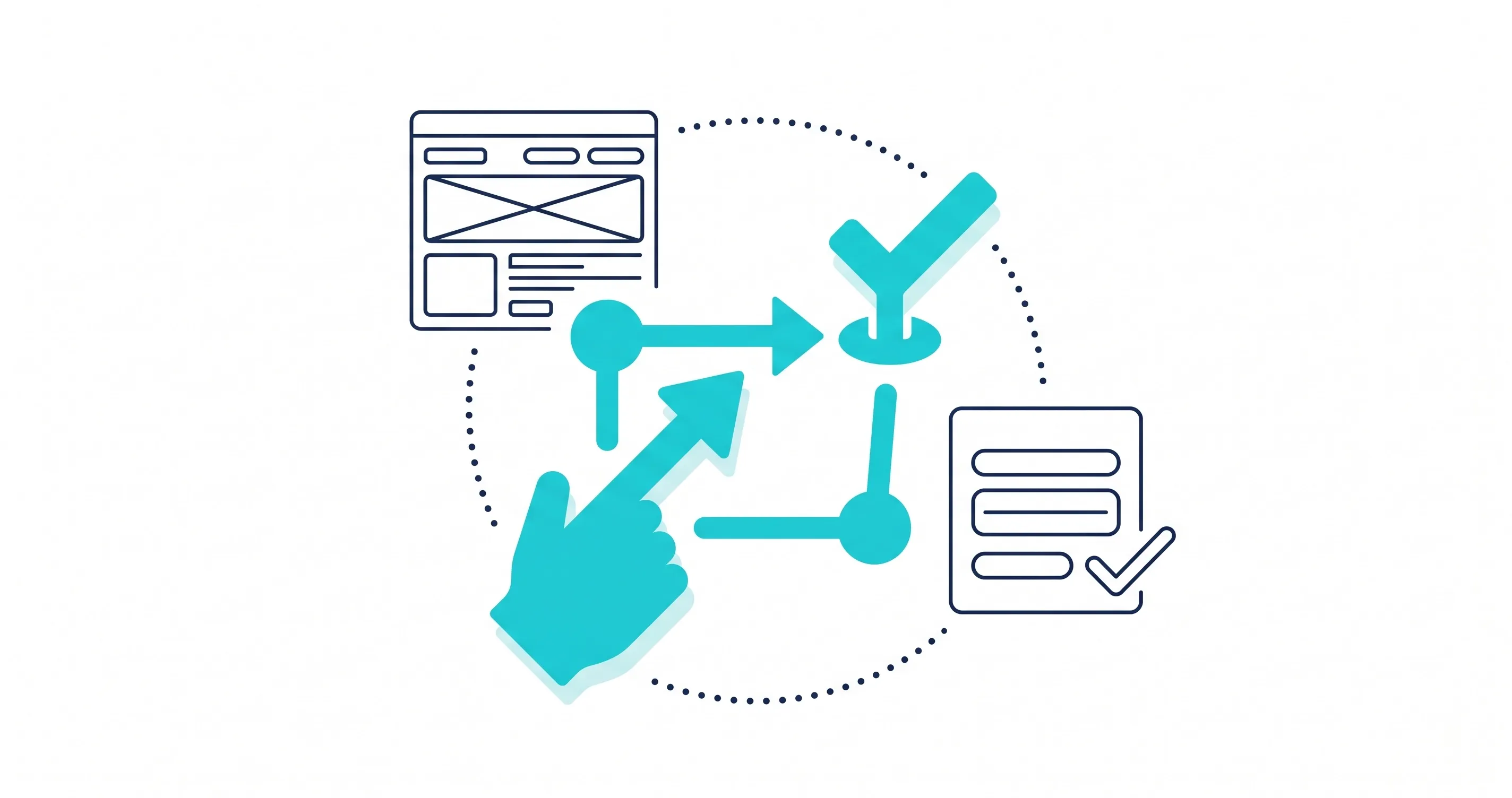
How White Space Improves Different Website Sections
White space can improve almost every part of a website, but the ideal spacing depends on the purpose of each section.
Hero sections: Space around the headline, supporting copy, and CTA helps establish the page's primary message.
Service sections: Separation between services makes individual offerings easier to scan and compare.
Forms: Proper spacing between fields improves clarity and makes forms feel less intimidating.
Testimonials: Space around customer feedback helps distinguish social proof from surrounding content.
Navigation: Consistent spacing between menu items improves usability and reduces visual clutter.
Footer: Grouping related links with appropriate spacing makes large footers easier to navigate.
For service-based businesses, these decisions are particularly important because visitors often need to understand an offering before deciding whether to contact the company.
Common White Space Mistakes That Hurt Conversions
White space can hurt a website when it is used without considering content relationships or the user journey.
Some common mistakes include:
- Using too little space between unrelated sections
- Creating unnecessarily large gaps
- Applying inconsistent spacing throughout the website
- Separating headings too far from their content
- Crowding CTAs with other elements
- Ignoring mobile spacing
- Using excessive empty space to create a minimalist look
Too little space creates clutter, but too much can make a page feel disconnected.
The right balance depends on the content and purpose of each section. Spacing should always make the page easier to understand.
How to Optimize White Space for Better Conversion Rates
Improving spacing should be part of the larger website layout optimization process. Instead of changing margins randomly, consider how each adjustment affects the visitor's journey.
Start With the User Journey
Begin by identifying what visitors should understand and do on each page.
A service page design, for example, may need to explain a problem, introduce the solution, present benefits, provide supporting evidence, and then encourage visitors to contact the business.
White space can separate these stages and make the progression easier to follow.
Test Spacing and Page Layouts
There is no universal measurement for perfect website white space.
The right amount depends on the page, content, audience, and device. When possible, test meaningful layout changes and compare how visitors respond.
You can adjust spacing around headings, CTAs, images, forms, and sections while keeping other major elements consistent.
Maintain Consistent Spacing Across Devices
Spacing that works well on a desktop may not work equally well on a smartphone.
Mobile screens have less available space, so excessive gaps can create unnecessary scrolling. At the same time, insufficient spacing can make text and interactive elements feel cramped.
Responsive design should adjust margins, padding, and section spacing while preserving the same visual hierarchy.
A strong UX and UI design approach considers these differences from the beginning rather than treating mobile as an afterthought.

Conclusion
White space in web design is an important part of creating clear, usable, and conversion-focused websites. It helps organize content, improve readability, establish visual hierarchy, and draw attention toward important actions.
The goal is not to fill a website with empty areas. Instead, every space should support a purpose. Good spacing keeps related elements connected while separating content that visitors need to understand independently.
When combined with strong content, responsive design, and thoughtful user experience, white space can make a website easier to use and more effective for business goals. A professional web design strategy should therefore treat spacing as part of the overall conversion experience.
Share this article