When visitors land on your website, their attention lasts only a few seconds. If your text is hard to read, too small, too dense, or poorly structured, they’ll likely leave before exploring further. That’s where website readability makes all the difference. It ensures that your words, visuals, and layout work together to guide readers naturally. Improve website readability not only helps users understand your message faster but also keeps them engaged longer, increasing the chances of conversion and trust.
What Website Readability Really Means
Website readability refers to how easily users can process and understand the content on a page. It’s more than just choosing clear words, it’s about how design supports comprehension. A readable website uses layout, font, and spacing to make information effortless to scan and digest.
Several key elements shape strong readability:
- Typography: The right font family and size improve legibility and reduce visual fatigue.
- Spacing: Adequate line height and paragraph spacing create breathing room for the eyes.
- Color: Proper contrast between text and background enhances clarity and accessibility.
- Structure: Headings, subheadings, and short paragraphs help users skim and retain key points.
When these factors work in harmony, they make your website not only look professional but also feel intuitive and trustworthy, a foundation for better engagement and conversion.
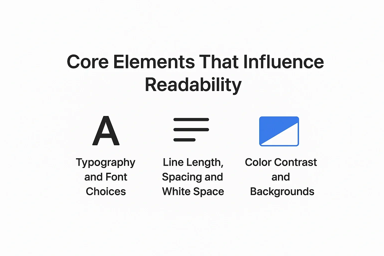
Core Elements That Influence Readability
Good readability doesn’t happen by chance, it’s designed. Every visual element on a webpage, from font style to spacing and color contrast, plays a role in how comfortably users consume your content. Let’s explore the core factors that define how readable your website really is.
Typography and Font Choices
Typography is the backbone of readability. Fonts should match your brand personality while staying easy on the eyes. Sans-serif fonts like Lato or Open Sans are ideal for digital screens due to their clean and modern design. Size consistency also matters, using a 16–18px body font ensures accessibility and balance.
When selecting fonts, make sure they align with your visual hierarchy and create a consistent reading rhythm across pages.
Line Length, Spacing and White Space
Dense text blocks can overwhelm readers. The optimal line length between 50 to 75 characters per line keeps the eyes from straining. Line height should be around 1.5 times the font size to create rhythm and flow.
White space, often overlooked, is just as crucial. It gives readers room to breathe, separates key sections, and prevents visual clutter. When used intentionally, white space guides attention to important calls-to-action and keeps the layout balanced.
Color Contrast and Backgrounds
Color contrast determines how easily text stands out from its background. High contrast (such as black text on a white or light background) increases clarity and accessibility. Avoid using light-colored text on bright backgrounds, it reduces legibility and strains the eyes.
Following WCAG accessibility standards ensures inclusivity while maintaining design aesthetics. Subtle background tones with bold headline colors can help emphasize key content and CTAs.
How Readability Impacts User Behaviour and Engagement
Readability directly shapes how users interact with your website. When your text is clear and visually balanced, visitors stay longer, scroll deeper, and engage more. Poor readability, on the other hand, leads to confusion and quick exits, raising your bounce rate.
Here’s how it affects core engagement metrics:
- Scan Behaviour: Readable pages allow users to scan quickly and find key information faster.
- Dwell Time: When text is visually appealing and structured well, users spend more time reading.
- Conversions: Clear content improves comprehension, which helps motivate actions like signing up or purchasing.
- SEO Benefits: Google values user experience, sites with low bounce rates and high dwell time often rank better.
Well-designed readability not only creates comfort for the reader but also builds trust and supports your site’s long-term SEO performance.
Practical Checklist to Improve Your Website Readability
Improving readability isn’t about redesigning your entire site, it’s about making smart, consistent tweaks that make your content easier to read and navigate. Use this actionable checklist to evaluate your pages:
- Limit fonts to 2–3 families to maintain visual harmony and reduce distraction.
- Set a base font size of 16–18px for paragraphs and 24–32px for headings.
- Use high color contrast (at least 4.5:1 ratio) for maximum clarity.
- Increase line height to around 1.5–1.6 for better scanning.
- Add generous white space between paragraphs, sections, and images.
- Check readability on mobile devices ensure text scales correctly and margins don’t crowd content.
- Align text to the left for natural reading flow. Avoid justified text blocks.
- Highlight key information using bold, bullet points, or subheadings to break up dense text.
- Test your readability regularly using tools like Hemingway Editor or WebAIM Contrast Checker.
If your design feels cluttered or inconsistent, explore the Portfolio to see how balanced spacing and typography can create visual comfort.
Common Readability Mistakes to Avoid
Even small errors can harm readability and make your content feel unprofessional. Avoid these common pitfalls:
- Using too many font styles or colors: it creates visual noise.
- Overly long paragraphs: they overwhelm readers and increase bounce rates.
- Poor contrast between text and background, especially on mobile.
- Tiny font sizes that strain the eyes.
- Ignoring responsive design: text that doesn’t adapt to different screens frustrates users.
- Skipping hierarchy: inconsistent heading sizes make scanning difficult.
Fixing these mistakes can dramatically improve user comfort and engagement ensuring visitors stay longer, read more, and trust your brand.
Conclusion
Readability is the foundation of great web design. It shapes how users experience, understand, and trust your content. A visually balanced site with proper typography, spacing, and color hierarchy keeps visitors engaged and encourages them to explore deeper.
Ready to create a website that’s clear, engaging, and built for results? Contact 1RealTour today to transform your design into a truly user-friendly experience.
Share this article