Visual hierarchy in web design is the science of guiding users’ eyes toward what matters most. It determines how visitors scan, read, and interact with a page influencing everything from trust to conversion rates. When hierarchy is strong, your design feels intuitive and easy to follow; when it’s weak, users get lost and leave. By understanding how the human brain processes information visually, designers can use size, color, spacing, and typography to create balance and focus.
What Is Visual Hierarchy?
Visual hierarchy is the structured arrangement of design elements to show their level of importance. It helps users instantly recognize what to read or click first, reducing cognitive load and improving overall experience. In web design, hierarchy is achieved through several key principles:
- Scale and Size: Larger elements attract attention first, making them perfect for headlines or CTAs.
- Color and Contrast: Bold colors and sharp contrasts highlight crucial areas while subtle tones recede.
- Spacing and Proximity: Grouping related elements together improves clarity and readability.
- Typography: Font weight, style, and alignment guide users’ flow through content.
- Repetition and Consistency: Using similar patterns builds familiarity and brand recognition.
A well-structured visual hierarchy blends these elements seamlessly, ensuring users navigate naturally and trust what they see.
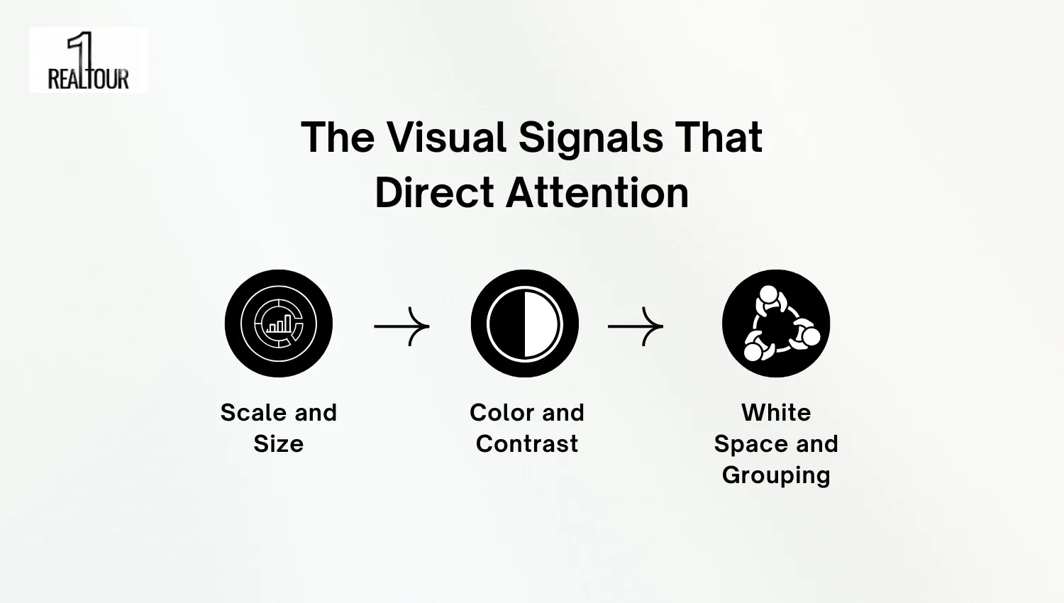
The Visual Signals That Direct Attention
Every element on a webpage sends a visual signal that tells users where to look first. Effective web design uses these cues to create order, highlight value, and simplify navigation. When applied strategically, these signals enhance both engagement and conversions. At 1REALTOUR, we use these visual principles to design websites that feel natural, professional, and conversion-focused.
Scale and Size
Larger elements naturally draw the eye first, helping users identify key content instantly. For example, a bold headline placed above smaller text immediately establishes priority. This works because the human brain associates larger objects with importance and urgency, guiding attention in milliseconds.
Color and Contrast
Color influences perception, while contrast defines clarity. A bright call-to-action button on a muted background, for instance, captures focus effortlessly. This effect relies on contrast sensitivity. Our visual system instinctively notices differences in hue and brightness, making important elements stand out.
White Space and Grouping
White space isn’t just empty space; it’s an active design tool. By surrounding a product image or section with generous spacing, you draw attention to it while reducing cognitive strain. Grouping related items together also helps users process information faster, as our brains naturally connect nearby objects into meaningful clusters.
The Cognitive Science Behind Hierarchy
Visual hierarchy isn’t just a design concept, it’s rooted in how our brains process and prioritize information. Human eyes naturally follow predictable patterns, such as the F-shaped and Z-shaped scanning layouts, which determine where users look first on a page. Designers use these insights to structure layouts that match instinctive reading behavior, guiding attention from headlines to supporting visuals and calls to action.
This principle aligns with Gestalt psychology, which explains how people perceive visual elements as unified groups rather than isolated parts. When hierarchy aligns with these cognitive rules, users find content easier to navigate and more trustworthy.
Accessibility and Performance Considerations
Modern web design must balance beauty with accessibility and performance. Visual hierarchy today goes beyond style, it ensures every visitor, regardless of ability or device, can engage comfortably. Meeting WCAG contrast standards enhances readability for users with visual impairments, while responsive typography and variable fonts maintain consistent hierarchy across different screen sizes. These elements also contribute to faster load times and better UX.
For designers aiming to align hierarchy with accessibility best practices, tools like WebAIM’s Contrast Checker are invaluable. This topic connects closely with our earlier insights on How Website Typography Impacts User Trust, where consistent, readable design fosters confidence and engagement.
Quick Comparison Table between Trustworthy vs Confusing Hierarchy
A strong visual hierarchy builds clarity and trust, while a weak one creates friction and confusion. The table below summarizes key contrasts designers should remember.
Aspect | Trustworthy Hierarchy | Confusing Hierarchy |
Layout | Clear and structured | Cluttered and chaotic |
Contrast | High for readability | Low or inconsistent |
Scale | Consistent sizing | Random proportions |
Spacing | Balanced and open | Crowded elements |
Navigation | Logical flow | Scattered focus |
Strong hierarchy enhances comprehension and credibility. A key factor in keeping users engaged and converting naturally.
Practical Checklist to Improve Your Visual Hierarchy
A well-structured visual hierarchy doesn’t happen by accident, it’s the result of thoughtful design choices. To help you refine your homepage or landing page layout, follow this actionable checklist that strengthens clarity, focus, and engagement.
- Audit your hero section: Make sure your primary headline instantly communicates your core offer. Place your most important CTA above the fold to guide attention naturally.
- Prioritize one main goal per page: Too many competing CTAs can confuse visitors. Highlight one conversion path clearly with visual weight, size, or color.
- Test your layout on mobile devices: Mobile-first hierarchy ensures that headlines, CTAs, and visuals scale properly. A responsive approach like those seen in ourPalm Springs Web Design projects can serve as a great benchmark.
- Use consistent font scaling: Establish a clear H1–H3 structure to help users scan and understand content faster.
- Leverage contrast and spacing: Contrast separates elements, while white space adds breathing room — both enhance readability.
- Analyze real performance metrics: Use A/B testing and heatmaps to measure how users interact with design elements.
- Showcase design proof: Visit ourPortfolio to see examples of effective visual hierarchy applied to real-world websites.
A consistent and well-balanced hierarchy not only boosts readability but also builds brand credibility and supports better conversions.
Common Mistakes and How to Fix Them
Even skilled designers can slip when managing hierarchy. Avoid these common pitfalls with quick fixes:
- Too many focal points: Limit to one main visual or message per section.
- Weak contrast: Strengthen readability with darker text and lighter backgrounds.
- Unclear CTA placement: Keep CTAs visible without overcrowding the page.
- Inconsistent font sizing: Define a clear typography scale for headings and body text.
- Ignoring spacing: Add enough padding and margins to improve clarity and flow.
When hierarchy feels effortless, users naturally understand what to do next — leading to a smoother, more effective experience.
Conclusion
Visual hierarchy is the foundation of an effective website, it guides attention, communicates brand clarity, and shapes how users interact with your content. When design elements like color, scale, and spacing work together, they create a seamless flow that builds trust and improves user experience.
Ready to elevate your website with a design that looks great and performs even better? Contact 1REALTOUR to help your business craft a visually engaging, conversion-focused website.
Share this article