A dropdown menu is created by nesting submenu links inside a parent navigation item and using HTML and CSS to control how those links appear. JavaScript can be added when you need more interactive behavior, while WordPress provides built-in menu options through many themes and plugins.
Dropdown menus are useful when a website has several related pages that need to fit into a clear navigation structure. When designed properly, they help visitors find information without overwhelming the main menu. When designed poorly, they can make navigation confusing, especially on smaller screens.
What Is a Dropdown Menu and How Does It Work?
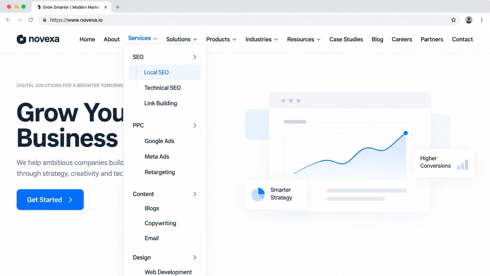
A dropdown menu is a navigation element that reveals additional links when a visitor interacts with a parent menu item. For example, a website might have a "Services" item that opens links for Web Design, SEO, Hosting, and Digital Marketing.
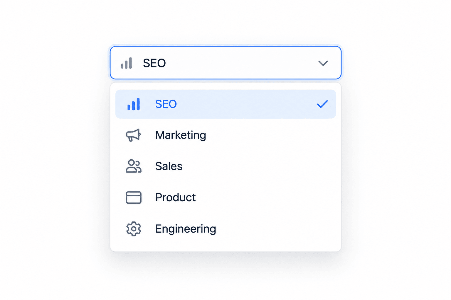
The basic structure is simple: a parent item contains a submenu, and CSS controls its visibility and appearance. JavaScript can add behaviors such as opening the menu on click, closing it when a user clicks elsewhere, or supporting more complex interactions.
A well-built dropdown should make related pages easier to reach without hiding important information from visitors.
Why Use a Dropdown Menu on Your Website?
Dropdown menus can be helpful when a website has multiple services, product categories, locations, or other groups of related pages. Instead of placing every page in the main navigation, related options can be organized beneath a logical parent category.
For businesses with larger websites, this approach can make navigation cleaner while giving visitors a direct path to deeper pages. The key is to use dropdowns as an organizational tool rather than filling them with every available link.
Organize Complex Website Navigation
A dropdown can group related pages under one main category. A remodeling company, for example, could place Kitchen Remodeling, Bathroom Remodeling, and Whole-Home Remodeling under a single "Services" menu.
This creates a more organized website navigation structure and reduces the number of top-level items competing for attention.
Improve User Experience
Visitors should be able to understand where to go without thinking too hard about the navigation. A clear dropdown gives users a preview of available options and can reduce unnecessary clicks.
The menu should remain predictable, readable, and easy to interact with. Good navigation is part of the broader relationship between visual design and usability, rather than an isolated feature.
Make More Pages Easier to Access
Dropdowns are particularly useful for websites with several related pages. They allow those pages to remain accessible from the main navigation without making the header excessively crowded.
However, important pages should not be buried several levels deep. Visitors should still be able to reach core services, contact information, and other high-value pages quickly.
How to Create a Dropdown Menu
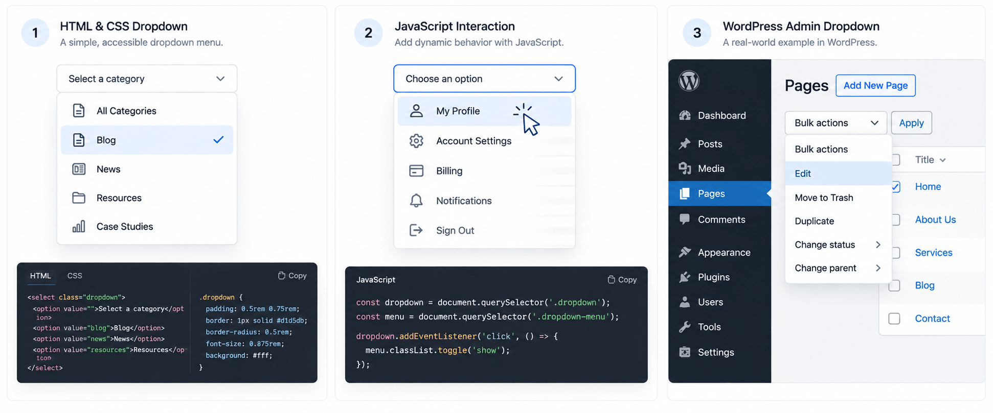
The right method depends on how your website is built and how much control you need. A custom website can use HTML and CSS directly, while JavaScript can provide additional interaction. WordPress users can often create dropdowns through the site's navigation settings without writing code.
Create a Dropdown Menu With HTML and CSS
HTML provides the navigation structure, while CSS controls how the submenu appears. A basic structure might include a parent list item containing another unordered list for the dropdown.
<nav>
  <ul class="menu">
    <li>
      <a href="/services/">Services</a>
      <ul class="dropdown">
        <li><a href="/web-design/">Web Design</a></li>
        <li><a href="/seo/">SEO</a></li>
        <li><a href="/hosting/">Hosting</a></li>
      </ul>
    </li>
  </ul>
</nav>
CSS can then hide the submenu until the visitor hovers over or otherwise interacts with the parent item. For a basic desktop menu, the important concepts are positioning the submenu correctly, controlling its visibility, and ensuring the links remain readable.
CSS alone can work well for simple interactions, but mobile behavior needs additional consideration because touchscreens do not have a traditional hover state.
Create a Dropdown Menu With JavaScript
JavaScript becomes useful when the menu needs click-based interaction or more advanced behavior. For example, a script can add or remove an active class when a visitor taps a menu button.
This approach is especially useful for responsive navigation where the same menu needs to behave differently across desktop and mobile devices.
JavaScript should enhance the navigation rather than make basic navigation dependent on unnecessary scripts. The underlying links should remain logically structured and usable.
Create a Dropdown Menu in WordPress
Many WordPress websites allow you to create dropdown navigation through the dashboard. You can add pages or custom links to a menu and arrange child items underneath a parent item.
The exact controls depend on the WordPress theme and navigation system being used. If the theme supports nested navigation, you can usually create the hierarchy visually without manually writing HTML or JavaScript.
For a business website, the menu should reflect the site's most important pages and services rather than simply reproducing the entire sitemap.
How to Design a User-Friendly Dropdown Menu
A dropdown should make navigation easier, not add another layer of confusion. Good dropdown menu design depends on clear organization, readable labels, predictable interactions, and careful consideration of how people use the menu on different devices.
Keep the navigation focused and make each option easy to understand. Some practical guidelines include:
- Use clear labels: Choose menu names that tell visitors exactly what they will find after clicking.
- Group related pages: Place services, products, or resources into logical categories instead of mixing unrelated links.
- Design for mobile: Make dropdowns easy to open and tap on touchscreens. Avoid menus that depend entirely on hover.
- Keep navigation consistent: Use the same structure and interaction patterns throughout the website.
- Avoid unnecessary depth: A visitor should not have to move through several nested menus to reach an important page.
- Make the menu visually clear: Spacing, typography, contrast, and hierarchy should help users scan available options quickly.
For larger websites, these decisions should work alongside the site's overall UX and UI design approach, not be treated as a separate design task.
Dropdown Menu Best Practices for SEO and Accessibility
A dropdown menu affects more than appearance. Navigation helps users move through a website and can also help search engines understand relationships between important pages. Accessibility is equally important because not every visitor interacts with menus using a mouse or touchscreen.
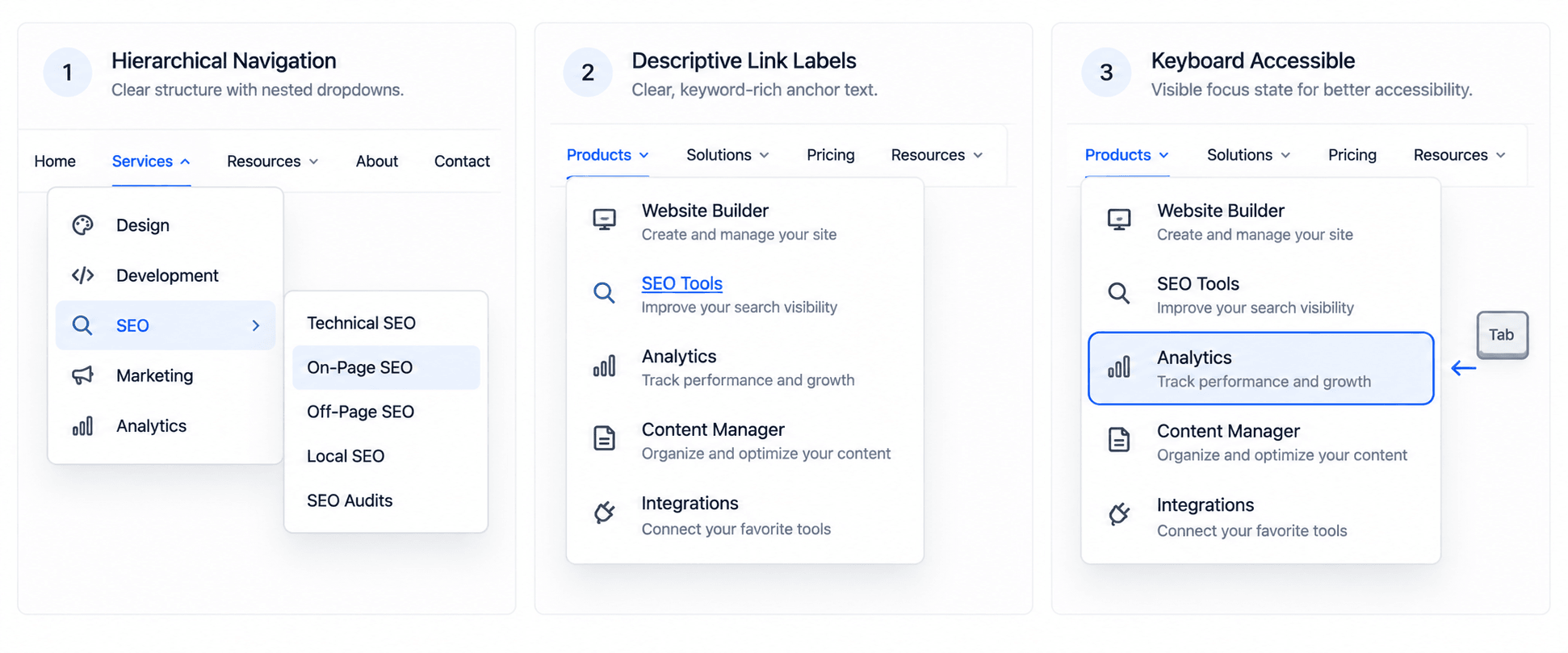
Create a Logical Website Structure
Organize navigation around meaningful categories and make important pages easy to reach. A clear hierarchy helps users understand how the website is organized and creates stronger connections between related pages.
Avoid placing every available page inside a single oversized dropdown. Instead, determine which pages deserve prominent navigation and which can be reached through other contextual links.
Use Descriptive Links and Anchor Text
Menu links should describe their destinations clearly. Labels such as "Services," "About," or "Contact" can be appropriate when their purpose is obvious, but more specific labels can help when visitors need additional context.
Descriptive navigation also supports a clearer information architecture. Every link should lead somewhere useful and match the expectation created by its label.
Make Menus Keyboard Accessible
Visitors who use keyboards or assistive technologies need to be able to reach and operate navigation controls. Interactive menu elements should have a clear focus state and should not require precise mouse movements to access submenu links.
Accessibility also means ensuring that mobile and desktop interactions are understandable and usable. A broader accessible web design approach can help prevent navigation from becoming a barrier.
How to Test and Improve Your Dropdown Menu
Do not assume a dropdown works properly just because it looks correct in a desktop browser. Test the actual experience across screen sizes and interaction methods.
Check whether:
- The dropdown opens and closes reliably.
- Every link is easy to click or tap.
- Text remains readable on smaller screens.
- Menus do not disappear before users can select an option.
- Keyboard users can reach every menu item.
- The dropdown does not cover important page content.
- Links lead to the correct destinations.
- The menu remains usable when viewed on different browsers and devices.
Watch someone unfamiliar with the website use the menu if possible. If they hesitate, miss an option, or cannot tell where a link will lead, the navigation may need to be simplified.
When Should You Use a Dropdown Menu?
A dropdown menu makes sense when you need to organize several closely related navigation options without filling the main header with too many links.
It can be a good choice for websites with:
- Multiple services within one business category.
- Large product or service catalogs.
- Several related resource sections.
- Multiple locations or business divisions.
- Content that naturally fits into clear categories.
A dropdown may not be the best solution when a website has only a few pages or when visitors need to see every important option immediately. In those situations, a simple navigation bar may provide a faster and clearer experience.
The goal is not to use a dropdown because it looks modern. The goal is to choose the navigation pattern that helps visitors find what they need with the least friction.
Conclusion
Creating a dropdown menu is relatively simple, but creating one that works well requires more than adding a hidden submenu. The navigation needs a logical structure, clear labels, responsive behavior, accessibility support, and enough testing to make sure visitors can use it comfortably.
Whether you build a custom dropdown with HTML and CSS, add JavaScript for more interaction, or use WordPress's navigation tools, keep the user's needs at the center of the design. A thoughtful navigation system can make a business website easier to use and help visitors reach important pages more efficiently.
If your website needs a cleaner navigation structure or a more effective overall design, 1REALTOUR provides custom web design services for businesses with a focus on practical, user-friendly websites.
Share this article