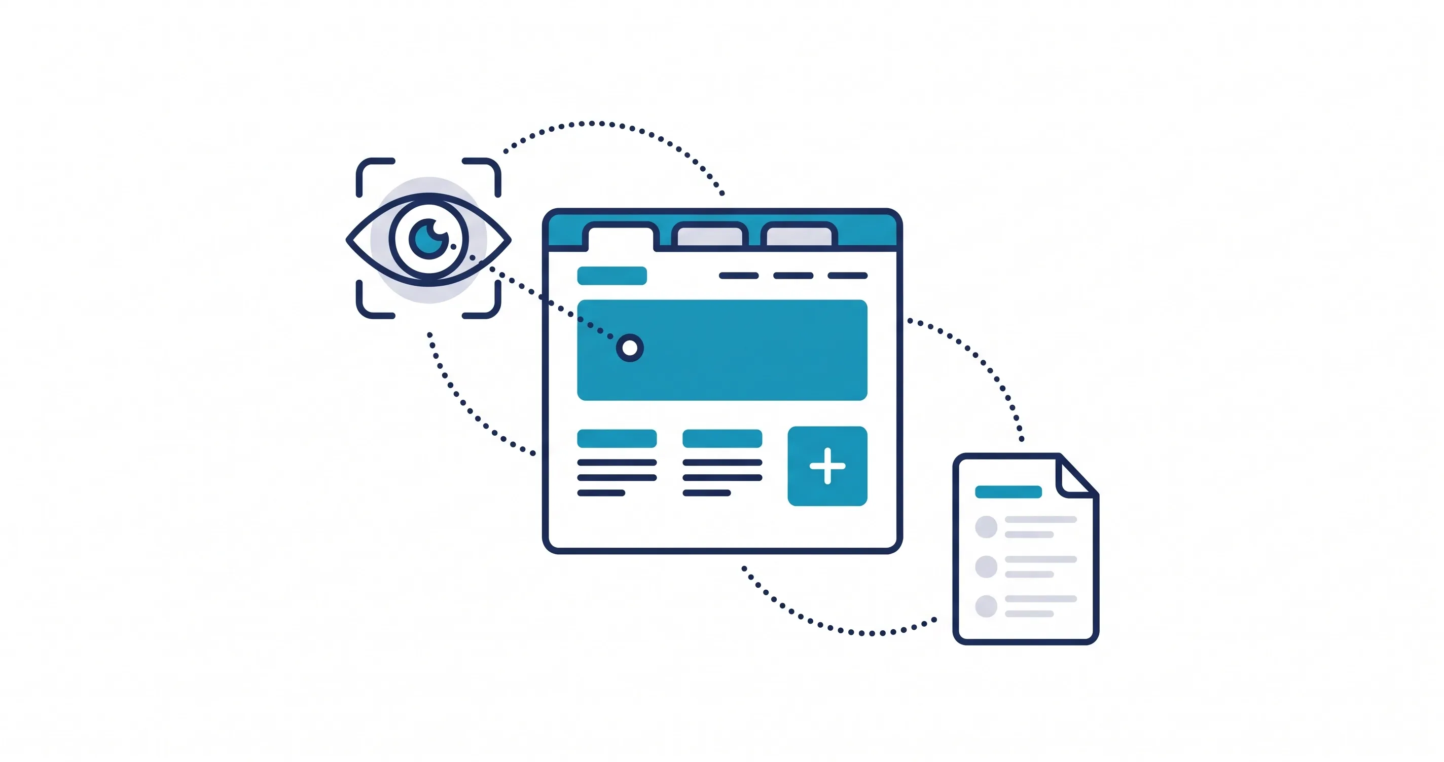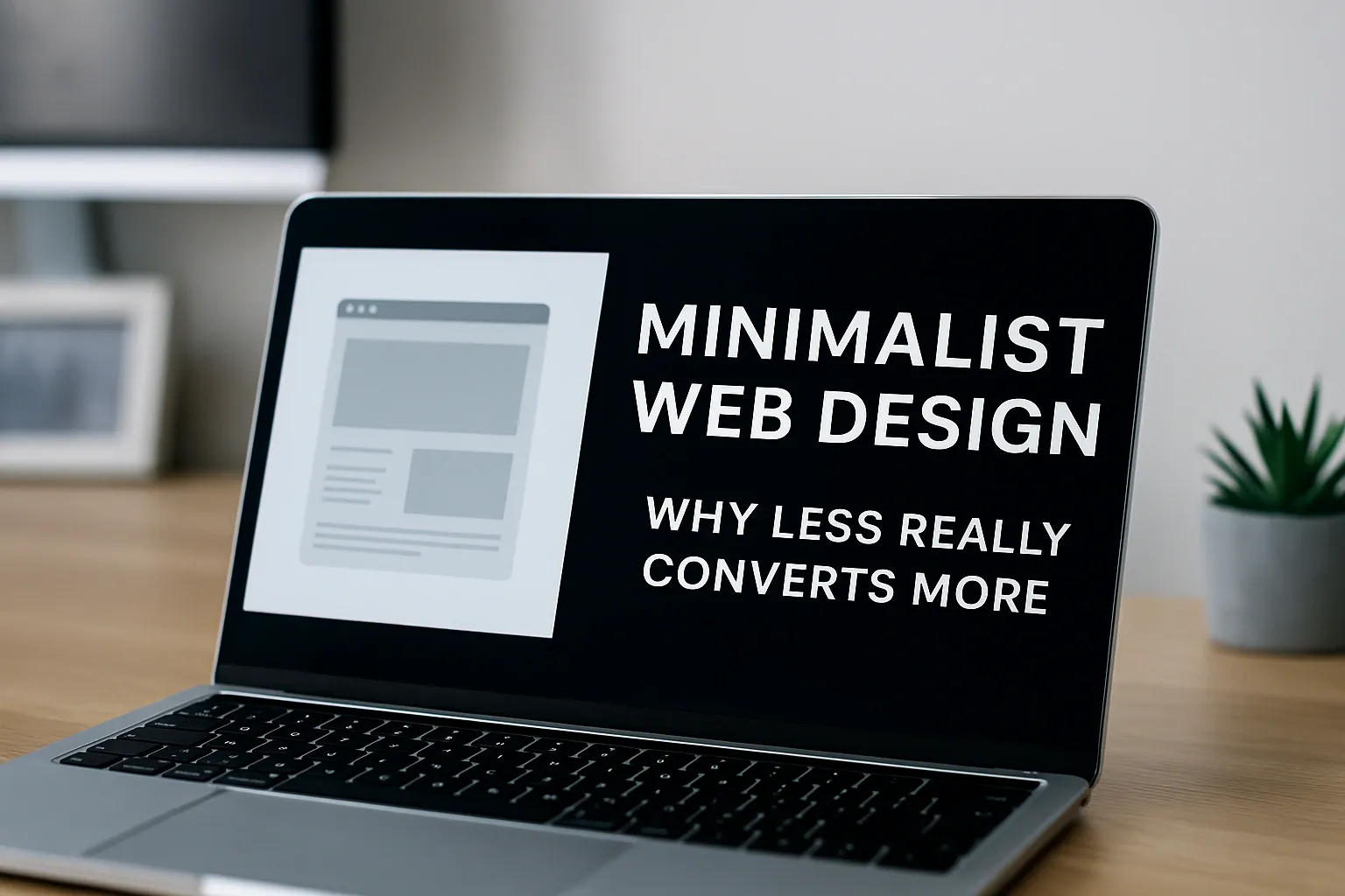
Minimalist web design isn’t just a style choice, it’s a strategic approach that removes distractions and guides users toward what truly matters. In a world where attention spans are shrinking, minimalism helps websites load faster, look cleaner, and convert better. By focusing on essential elements only, designers create experiences that feel effortless and engaging. This approach balances form and function, letting every design decision serve a purpose.
What Is Minimalist Web Design?
Minimalist web design is the art of crafting digital spaces where simplicity meets purpose. It focuses on using fewer elements colors, shapes, text, and visuals to create clarity and ease of use. Instead of overwhelming users with choices, it relies on clean layouts and intentional spacing to direct attention naturally.
Core elements of minimalist design include ample whitespace, which allows content to breathe and enhances visual balance. A limited color palette maintains harmony while supporting brand identity, and clean typography ensures legibility across all devices. Together, these components establish a sleek, modern aesthetic that feels both professional and intuitive, a perfect fit for brands aiming to build trust through clarity.
How Minimalism Drives Conversions
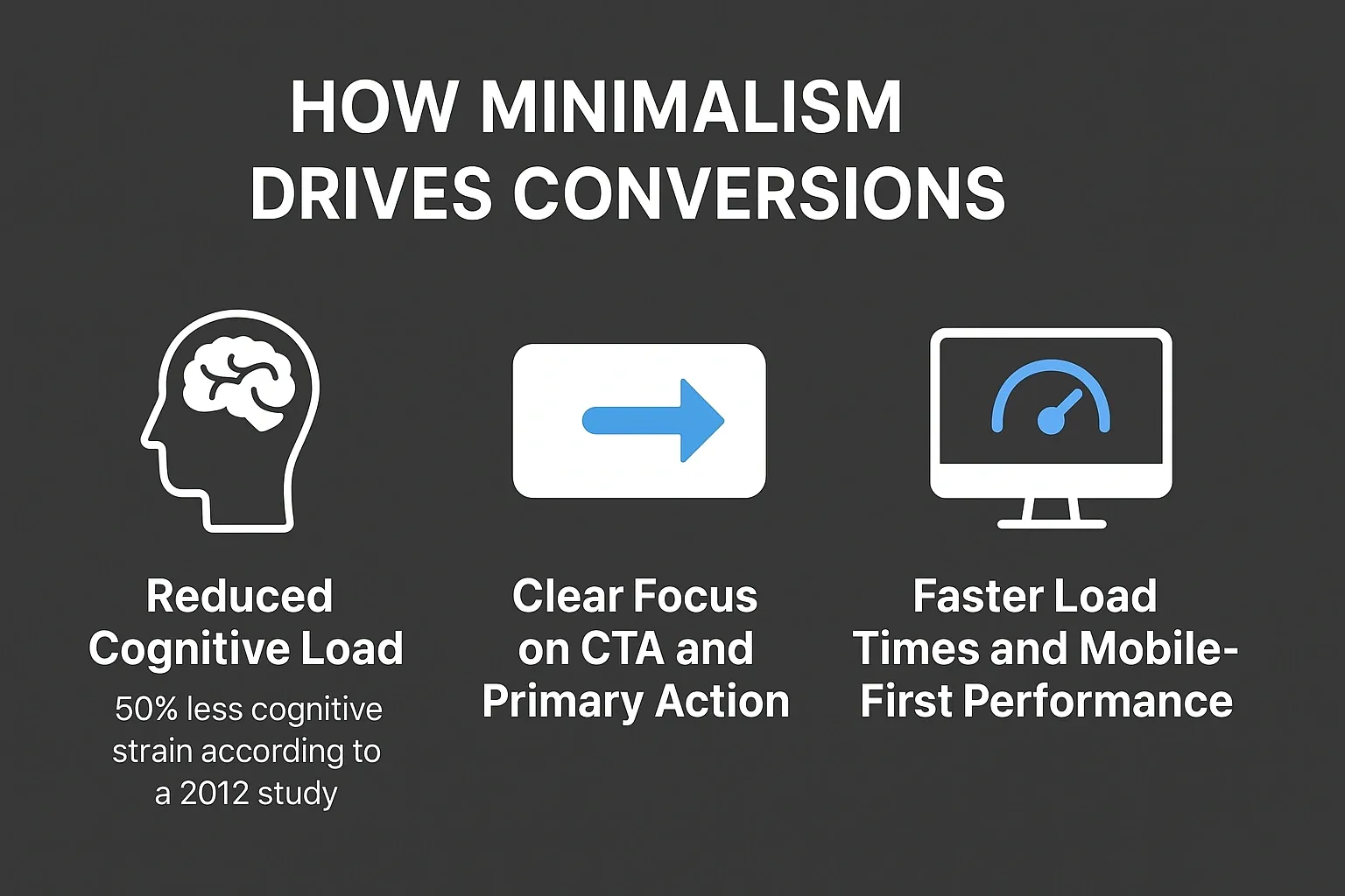
Minimalist web design simplifies user journeys and improves how visitors interact with your website. By eliminating unnecessary elements, it reduces confusion, strengthens brand messaging, and keeps users focused on what matters most, engaging and taking action.
Reduced Cognitive Load
A cluttered website forces visitors to process too much information at once, leading to fatigue and quick exits. Minimalism, however, reduces cognitive load, allowing users to absorb content effortlessly.A Google UX research study found that simpler website layouts are perceived as more beautiful and easier to navigate, directly influencing trust and engagement levels. When users can find what they need quickly, they’re far more likely to convert.
Clear Focus on CTA and Primary Action
In minimalist layouts, every element supports a single purpose, guiding users toward a primary call-to-action (CTA). Without unnecessary buttons or visual clutter, the CTA becomes more prominent and persuasive. This clear focus improves conversions, especially for service-based businesses where one action like contacting or booking defines success.
Faster Load Times and Mobile-First Performance
Minimalist websites often use fewer scripts, smaller image files, and lightweight layouts, leading to faster page speeds. A faster website not only enhances the user experience but also boosts rankings in Google’s Core Web Vitals. In a mobile-first world, clean design ensures seamless accessibility and consistent performance across all devices.
Key Principles of Minimalist Web Design
Minimalist web design follows a set of principles that balance aesthetic appeal with usability. These principles ensure every pixel serves a purpose and the overall structure remains consistent and intentional.
Whitespace and Visual Clarity
Whitespace also known as negative space is one of the most powerful tools in minimalist design. It helps separate content blocks, emphasize key elements, and make interfaces feel calm and professional. This clarity gives users mental breathing room and guides them naturally through the page.
Limited Color & Typography Systems
Minimalist websites typically rely on a limited color palette and simple font pairings to maintain balance and visual cohesion. This approach enhances readability and keeps attention where it belongs on your message. Consistent typography also builds brand recognition across every page.
Strategic Content Hierarchy
Minimalism isn’t just about fewer visuals, it’s also about smarter structure. Clear content hierarchy uses font size, contrast, and placement to guide users through your story step by step. Headlines attract attention, subheads clarify intent, and body text provides context all designed to help users scan quickly and engage deeper.
Comparison Table: Minimalist vs Cluttered Design
Aspect | Minimalist Design | Cluttered Design |
|---|---|---|
Focus | Clear and intentional highlights core message or CTA | Distracted too many competing elements |
Load Speed | Lightweight, fast-loading pages | Slower due to excessive graphics and code |
CTA Visibility | Prominent and easy to find | Lost among unnecessary visuals |
Trust Perception | Feels modern, credible, and user-friendly | Feels outdated and less professional |
User Experience | Smooth navigation and clear hierarchy | Confusing structure and poor readability |
Conversion Rate | Higher engagement and conversions | Lower conversions due to decision fatigue |
A minimalist website delivers a calm and focused experience. Visitors instinctively trust simple layouts more because they can easily find what they need without frustration.
Practical Checklist to Implement Minimalist Design
Building a minimalist website doesn’t mean removing everything, it’s about keeping only what enhances clarity and conversions. Use this checklist to guide your next redesign:
- Conduct a content and design audit to identify unnecessary visual elements.
- Reduce color palette to 2–3 main tones that align with your brand.
- Use clear typography and maintain consistent spacing for readability.
- Prioritize key content and CTAs above the fold to drive action.
- Simplify navigation to keep user paths short and intuitive.
- Test designs on multiple screen sizes to ensure mobile responsiveness.
- Leverage high-quality, purposeful imagery that supports your message.
- Optimize website speed by compressing images and removing unused code.
- Use user feedback tools or A/B testing to see which layouts convert better.
- Partner with Web Design experts in clean, modern interfaces for professional minimal layouts..
By applying these principles, your website can look modern, feel intuitive, and perform at its best, both in user engagement and SEO rankings.
Common Mistakes to Avoid in Minimalist Design
Minimalism is powerful, but when overdone, it can backfire. Here are a few common mistakes and how to fix them:
- Too Bare or Empty: Removing too much can make your site feel unfinished.Fix: Keep essential elements like navigation, headings, and visuals that guide user flow.
- Unclear Navigation: Minimal menus can confuse visitors.Fix: Use concise labels and a simple navigation bar that’s always visible.
- Hidden or Hard-to-Find Content: Oversimplified designs sometimes bury important details.Fix: Maintain logical content hierarchy, prioritize clarity over aesthetics.
- Lack of Contrast: Pale color combinations can hurt readability.Fix: Use enough contrast between text and background for accessibility and legibility.
Even minimalist design should communicate effectively not just look clean.
Conclusion
A well-executed minimalist design blends clarity, focus, and visual calm helping users find what they need faster and convert more easily. By focusing on simplicity, whitespace, and meaningful hierarchy, your website becomes both beautiful and strategic.
Want to create minimalism website that can elevate your digital presence? Contact us today to start designing a site that truly converts.
Share this article