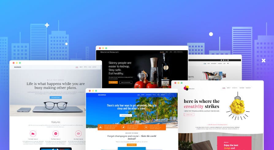
Choosing the right website layout shapes how visitors see your brand and interact with your content. A clear and thoughtful layout helps users move through your pages with ease and find the information they need quickly. When your layout feels simple, modern, and well-organized, it creates a smooth experience that keeps visitors engaged. Strong website layout ideas set the foundation for better design, stronger conversions, and long-term growth.
What Makes a Website Layout Effective
A strong layout guides users through your pages in a natural way. It combines structure, spacing, and visual order to help visitors understand what matters most. Effective layouts build trust, improve clarity, and support the goals of your website. When your layout works well, every part of your design feels clean, easy, and purposeful.
Why Layout Matters for User Experience
A good layout makes your website simple to use. It helps users scan information quickly and find key details without any confusion. When the layout feels organized, people stay longer, explore more pages, and feel comfortable with your brand. Clear layout planning leads to a smoother overall experience.
How Layout Controls Visual Flow
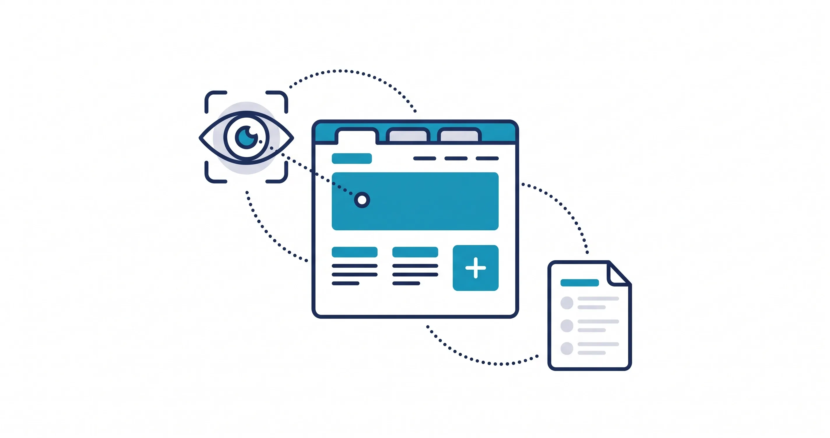
Layouts guide the visitor’s eyes from one section to the next. Strong visual flow highlights headlines, images, and important actions at the right moments. This direction helps users understand where to look first and how to move through the page. A clean flow makes your content feel balanced and easy to follow.
Key Principles Behind Great Layouts
Great layouts rely on spacing, alignment, contrast, and simplicity. These principles help each element stand out without overwhelming users. When your layout follows these rules, your design becomes readable, modern, and effective. Simple choices create a strong impact and make your website feel polished.
10 Best Website Layout Ideas for Modern Designs
Below are ten website layout ideas that work well for many modern websites. Each one improves user experience, supports visual flow, and strengthens your design. The right layout helps users move through your content naturally and encourages them to take action.
F-Layout
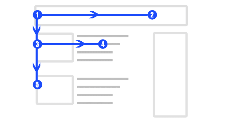
The F-Layout follows the natural scanning pattern most users follow online. People read from left to right and then downward, forming an “F” shape. This makes it a strong choice for content-heavy pages where clarity matters.
Why it works:
- Guides users to key information quickly
- Perfect for blogs, news websites, and article pages
- Supports a simple, consistent reading flow
Z-Layout
The Z-Layout creates a path where the eyes move from the top left to the top right, then diagonally down to the bottom left, and across again. This flow mirrors how users scan landing pages with a central message.
Best for:
- Landing pages
- Pages with a single goal or CTA
- Hero sections that need clear direction
Split-Screen Layout
A split-screen layout divides the page into two equal visual sections. This format showcases two messages, products, or user paths without crowding the design.
Use cases:
- Highlighting two categories
- Presenting dual options, such as “Men vs Women”
- Showing comparisons side-by-side
Full-Width Hero Layout
This layout uses a bold hero banner at the top of the page with strong text and a clear call-to-action. It sets the tone instantly and focuses the user’s attention on your main message.
Benefits:
- High visual impact
- Great for product launches
- Helps set brand tone immediately
Grid-Based Layout
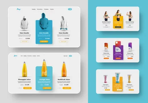
A grid layout organizes content into equal sections, making the design clean and easy to browse. Visual structure helps users scan information faster.
Works well for:
- eCommerce product pages
- Portfolio websites
- Gallery-style layouts
Advantages:
- Clean structure
- Easy content organization
- Consistent spacing and alignment
Single-Column Long-Scroll Layout
This layout focuses on one continuous column of content. It is simple, mobile-friendly, and ideal for storytelling.
Why it’s effective:
- Users scroll naturally without distraction
- Perfect for mobile-first websites
- Supports narrative content and step-by-step flow
Minimalist Layout
Minimalist layouts rely on white space, clean typography, and simple structure. They remove anything unnecessary to help users focus on the message.
Key features:
- Strong visual clarity
- Smooth and distraction-free design
- Works well for modern brands
Magazine-Style Layout
Magazine layouts mix images, text, and modules in a dynamic, editorial style. They work for websites with frequent content updates.
Perfect for:
- News websites
- Online magazines
- Blogs with multiple categories
Benefits:
- Engaging visual storytelling
- Attractive use of images
- Flexible layout options
Asymmetrical Layout
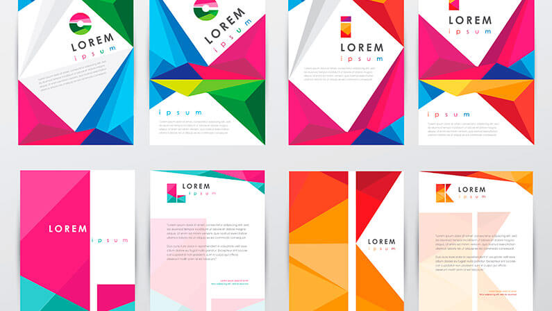
Asymmetrical designs break balance on purpose to guide attention and create visual interest. This style is popular in creative industries.
Why designers use it:
- Adds energy and personality
- Makes layouts look modern and bold
- Helps emphasize key elements
How to Choose the Right Layout for Your Website
Choosing the right layout depends on your design goals, brand style, and user needs. A strong layout supports both usability and visual appeal.
Match Layout to Your Brand and Goals
Your layout should reflect your brand personality and the purpose of your website.
Examples:
- Minimal layout → clean, professional brands
- Asymmetrical layout → creative or bold brands
- Grid layout → product-heavy websites
Consider Your Audience’s Behavior
Your users’ habits help define the layout that works best for them.
- Do they browse quickly? Choose simple layouts.
- Do they prefer visuals? Choose card or grid layouts.
- Do they scroll often? Use long-scroll layouts.
Think About Your Content Type and Volume
Different layouts suit different content needs.
- Large content libraries → grid or card layouts
- Storytelling pages → long-scroll layout
- Landing pages → Z-Layout or hero layout
Tips to Optimize Any Website Layout
A strong layout becomes more effective when you refine the structure, spacing, and flow. These tips help you improve clarity and keep users focused on the most important parts of your website.
Use Visual Hierarchy for Clarity
A clear hierarchy guides users through your page. You show them what matters most and what they should read next. Good hierarchy improves scanning and supports quick decisions.
Key ways to build hierarchy include:
- Using large headings for important sections
- Making CTAs bold and easy to find
- Highlighting key points with size, color, or placement
These small changes help users follow your content without confusion.
Keep Navigation Simple
Simple navigation helps users move through your website without effort. Clear menus reduce frustration and increase time on your pages. A clean structure also helps search engines understand your layout.
Useful tips:
- Keep menu items short and easy to read
- Limit top-level links to essential pages
- Add a clear mobile menu for smaller screens
Simple navigation creates a smooth experience for all users.
Prioritize Mobile-First Design
Mobile-first design helps you reach users who browse on phones. It also improves performance across all devices. This approach keeps your layouts clean and easy to use.
Strong mobile-first improvements include:
- Stacking sections vertically
- Using readable font sizes
- Making buttons large enough for touch
These steps help users feel comfortable on smaller screens.
Use White Space and Balanced Sections
White space gives your layout room to breathe. It makes your text more readable and your visuals easier to understand. Balanced spacing also increases engagement.
Helpful adjustments:
- Add padding between sections
- Use margin around images and text
- Avoid placing too many elements close together
White space keeps your design clean and modern.
Common Layout Mistakes to Avoid
Avoiding common layout errors helps your website stay clear, fast, and user-friendly. These mistakes often confuse visitors and reduce engagement, which leads to lower conversions and weaker trust.
Overcrowded Pages
Crowded screens overwhelm users. Too much text or too many visuals cause confusion and push visitors away. Keep your pages simple and focus on the message. A clean layout gives people space to breathe and encourages them to stay longer.
Disorganized Content Blocks
Random placement of elements breaks the flow of your layout. When users cannot follow a clear path, they leave quickly. Group related items together and use consistent spacing across your site. This structure helps users scan your content easily and move through your website naturally.
Ignoring Mobile Responsiveness
A layout that works only on desktop creates problems for mobile users. Buttons become too small, and text becomes hard to read on smaller screens. Make every layout responsive from the start. Mobile-friendly adjustments ensure that every user has the same smooth experience.
Weak or Missing CTAs
A website without strong calls-to-action loses conversions. CTAs guide users toward the next step and help you turn visitors into leads or customers. Use clear language and place CTAs where they get attention. Strong CTAs make your layout more purposeful and user-focused.
Conclusion
Modern website layouts shape how users explore your pages, understand your message, and take action. When your layout stays clean, balanced, and supported by strong design principles, visitors enjoy a smooth experience from start to finish. A thoughtful layout also improves readability, increases engagement, and strengthens your website’s performance across all devices. When you pair the right layout with your brand goals and user behavior, you create a modern design that feels clear, inviting, and built for results.
Read More About: UX Design Tips For Ecommerce Product Pages
Share this article