10 best website layout ideas
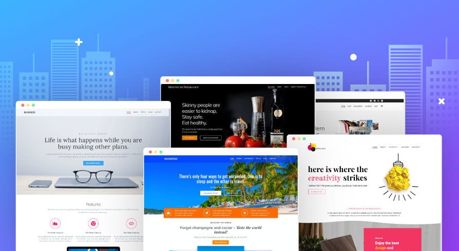
One of the first things in website design is choosing the appropriate layout. The foundation of your website, its layout has a big influence on how user-friendly and communicative you are online. This post offers 10 website layout ideas that can help you create your website the proper way the first time, from split screens to asymmetrical designs to traditional patterns.
Table of Contents
What is a website layout?
The arrangement of all visual components of a webpage is called a website layout. We can better direct the user experience by controlling the relationship between page items by purposefully arranging them.
A layout is an essential part of web design that establishes the order in which page elements are noticed by users, which aspects grab the most attention, and the overall visual harmony of the website. A website layout can improve a website’s usability and messaging due to its visual significance.

How to choose the right website layout
Selecting the ideal website layout is essential to providing the best possible user experience. Recognize your target audience and the goal of your website before anything else. Think of elements like visual appeal, usability, and simplicity. Choose the best layout to use when presenting your articles, goods, or services. Strike a balance between usefulness and aesthetics to provide accessible and simple navigation across all platforms. Determine which layout most appeals to your target audience by testing various versions and getting feedback. Give responsive design top priority to support different screen widths and improve user experience. In the end, a well-designed website layout should communicate your brand, satisfy customer demands, and encourage desired actions—like making a purchase, reserving a service, or consuming content.
10 best website layout ideas
Z-pattern layout
Upon coming across a novel webpage, we frequently scan it using a Z-pattern, advancing from upper left to upper right, descending to lower left, and then returning to the right. To take advantage of this, the Z-layout positions the call-to-action and navigation menu on the right, and the logo on the top left. The diagonal Z-section is a great place to include eye-catching material that uses images and typography to stand out. The main call to action, which impels visitors to act, is located near the bottom of the Z. This design is quite effective for visually stimulating pages, especially landing pages with a conversion goal.
F-pattern layout
The F-pattern layout, like the Z-pattern, takes advantage of typical scanning tendencies, particularly for webpages with a lot of content. With the left side serving as the focal point, visitors usually concentrate on the top horizontal area before scanning vertically downward. To engage visitors right away, invest on the top fold with attention-grabbing headlines, subtitles, and photos. To direct viewers to pertinent areas, make use of a navigation menu and anchor messages. To make the text look better, add formatting elements, icons, or images to the left-hand vertical line. The F-pattern layout is perfect for text-heavy websites like blogs since it maximizes reading and interaction on both the homepage and individual post pages.

Fullscreen image layout
A fullscreen picture layout, with an extra-large image at the forefront, produces an engrossing and immersive homepage design. This design seamlessly adapts to mobile devices while succinctly communicating your identity and products. Pick powerful images that are appropriate for your brand and pair them with succinct text to effectively communicate your point. This arrangement is excellent for displaying eye-catching graphics and is best suited for companies who want to highlight particular products or markets. A fullscreen picture layout makes a lasting impact on visitors and invites them to explore more into your offers, whether it’s used for wedding websites showcasing love tales or photography portfolios introducing new collections.
Split screen layout
A split screen arrangement removes negative space and creates symmetrical balance by dividing the screen vertically. Each segment can support a single topic from several angles or communicate a new idea thanks to its design. For example, a website design for a dining establishment has an eye-catching image on the left and matching text on the right that work well together. This design works well in situations when customers must select between two options, such as in the “Men’s” and “Women’s” categories on e-commerce websites. Think of using motion effects to increase engagement, such as one-side parallax scrolling or expanding the layout across the second fold with alternate content. The split screen layout works well for online retailers that segregate their customer base based on behavior or demographics. It is also ideal for websites that combine imagery and copy or have contrasting content kinds.
Asymmetrical layout
This chic website style divides the composition similarly to a split screen, but with an asymmetrical shift in balance. Certain aspects are highlighted by the visual movement created by this dynamic design. Some elements accentuate themselves as focal points by playing with scale, color, and arrangement. Use larger proportions and striking contrasts to draw attention to important content and give it more visual weight. This style is perfect for modern and captivating designs. It is appropriate for companies and design agencies looking to improve user engagement with an inventive look. In terms of website design, asymmetrical layouts are a visually appealing and dynamic way to showcase products or inspire activities.

Single column layout
The content is presented in a simple vertical manner on the single-column website layout, which facilitates scrolling for quick navigation. Add a fixed menu or “Back to Top” button for easy navigation to improve the user experience. Use headers, line breaks, and graphics to break up material on text-heavy websites to make them easier to read. This layout guarantees readability and accessibility for those looking for in-depth information or updates, making it perfect for long-form material or chronological displays like blogs or social media feeds. Users may easily move between updates or read articles in a single column, which makes it a useful and user-friendly option for a variety of content-rich websites.
Box-based layout
The website’s box-based style arranges content into geometric patterns so that each component retains its importance without taking center stage. Through these boxes, users can explore several webpages on themes of interest. Include a sizable featured box in the header that connects to the different parts that follow. Curate imagery to maintain brand identity and coherence. This layout is simple to create with Wix Pro Gallery, which gives you control over the number of columns, rows, and quality of the images. Perfect for websites that have lots of relevant pages, like portfolios for graphic designers, where each box connects to a project page for easy research.
Cards layout
Like the box-based design, the cards layout uses rectangular containers to display different types of content in equal measure. This non-hierarchical method guarantees that every piece of information is given equal weight. All cards have the same features that make content importation simple and the modular design adaptable to different screen sizes. Even with the wealth of information, surfing is made easier by this user-friendly interface. The decks style provides an aesthetically pleasing and intuitive way to present a variety of content, making it perfect for content-rich websites like vlogs or online businesses.

Magazine layout
The magazine website layout uses a multi-column grid for a sophisticated visual hierarchy, drawing inspiration from printed newspapers. Major headlines can be made to stand out among smaller items by customizing each container. Effective attention allocation can be ensured by varying the size, placement, and design detail of the elements. This arrangement maintains order and cleanliness while accommodating readers’ attention spans through the integration of the F-shaped skim reading pattern. The magazine style is a compelling option for presenting a varied range of content because it delivers a balanced blend of readability and visual appeal, making it ideal for content-rich websites like news publications or blogs.
Horizontal strips layout
The webpage is divided into full-width strips by this website layout, which makes scrolling through it interesting and varied. The virtually fullscreen strips each present a different surprise, increasing users’ suspense as they browse. Use different hues from your color palette to distinguish each strip, or combine written and visual content. Enhancing visual interest can be achieved by adding elements like parallax scrolling, which provide the background motion and depth. This style, with its dynamic composition and surprises at every scroll, captivates readers and is perfect for one-page websites with long-scroll designs. This design provides users exploring the homepage with an engaging and immersive browsing experience, regardless of the content being showcased—products, services, or narrative.
Conclusion
In conclusion, there are countless opportunities to create aesthetically pleasing and intuitive online experiences thanks to the wide variety of website style alternatives. Every layout option has an own set of benefits, ranging from the dynamic engagement of fullscreen strips to the elegant simplicity of single-column designs. You may choose the ideal layout to highlight your brand and draw in visitors by carefully evaluating the type of material you’re posting, your audience’s interests, and the interactions you want users to have with it. It’s important to put readability, navigation, and aesthetic appeal first regardless of whether you use an asymmetrical split-screen layout or a magazine-style grid. You can easily develop a website that stands out from the crowd and makes an impression on your audience if you keep these ten 10 website layout ideas in mind.
Read More UX Design Tips For Ecommerce Product Pages
FAQ’S
How can I implement these layout ideas on my website?
You can customize your website using website builders or by hiring a web developer.
Are these layouts suitable for all types of websites?
These layouts can be adapted for various website types, from portfolios to e-commerce sites.
Can I mix and match elements from different layouts?
Yes, you can combine elements from different layouts to create a unique and personalized design for your website.


