Website Navigation: The Ultimate Guide
Navigating a website seamlessly is key to enhancing user experience and engagement. In this comprehensive guide, we’ll delve into the intricacies of website navigation, offering expert insights and practical tips to optimize your site’s navigation structure. Whether you’re a seasoned web developer or a novice, mastering website navigation is essential for driving traffic, reducing bounce rates, and ultimately achieving your online objectives. Join us on this journey as we explore the fundamentals of effective website navigation and empower you to create intuitive, user-friendly website experiences.
Table of Contents
What is website navigation?
Website navigation refers to the system or structure that allows users to move around a website and access its content easily. It encompasses menus, links, buttons, and other elements that guide users to different pages or sections of the website. Effective website navigation ensures a seamless and intuitive browsing experience, enabling users to find the information they need quickly and efficiently. It plays a crucial role in enhancing user engagement, improving search engine visibility, and ultimately achieving the website’s goals, whether it’s providing information, promoting products or services, or facilitating online transactions.
What is a website navigation menu?
A website navigation menu is a collection of links or buttons typically displayed prominently on a webpage. It serves as a roadmap for users, allowing them to easily navigate to different sections or pages within the website. The navigation menu usually appears at the top, side, or bottom of a webpage and may include dropdown or nested menus for organizing content hierarchically. It provides users with quick access to essential pages such as home, about, services, products, and contact. A well-designed navigation menu enhances user experience by making it easy for visitors to find the information they’re looking for efficiently.

What is sub-navigation on a website?
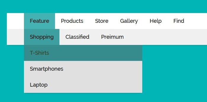
Sub-navigation on a website refers to secondary navigation menus or links that appear within specific sections or pages of a website. It helps users navigate to related content or subsections within a broader category. Sub-navigation menus are often nested under primary navigation items and provide further refinement or organization of content. For example, on an e-commerce website, sub-navigation might include options like product categories, filters, or sorting options within a specific product category page. Sub-navigation enhances the user experience by offering more targeted access to relevant content, making it easier for visitors to find what they’re looking for efficiently.
What are the types of website navigation?
Horizontal Navigation Bar
A horizontal navigation bar, also known as a menu bar, is a common website design element positioned horizontally across the top of webpages. It typically contains clickable links or buttons that serve as primary navigation options, directing users to different sections or pages of the website. Horizontal navigation bars are often located near the header of a webpage for easy access and visibility. They help users navigate through the website’s content, providing a clear and organized structure. Horizontal navigation bars are customizable and can include drop-down menus, search bars, or other interactive elements to enhance user experience and accessibility.
Dropdown Navigation Menu
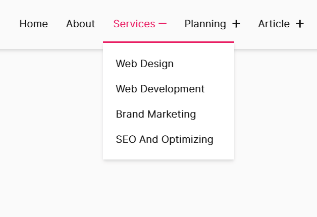
A dropdown navigation menu is a type of website navigation that allows users to access additional menu options by hovering or clicking on a primary menu item. When a user interacts with the primary menu item, a dropdown menu appears below it, displaying a list of sub-menu items or options. This design conserves space on the webpage while providing a hierarchical structure for organizing website content. Dropdown menus are commonly used for categorizing and organizing large amounts of information, such as product categories, services, or sections of a website. They offer a convenient way for users to navigate through complex website structures with ease.

Hamburger Navigation Menu
The Hamburger Navigation Menu, named for its resemblance to a hamburger icon, is a common design pattern used in website navigation. It typically consists of three horizontal lines stacked on top of each other, resembling a hamburger. When clicked or tapped, the hamburger icon reveals a menu that slides in from the side of the screen, displaying navigation options. This design is popular for mobile and responsive websites, as it saves space on smaller screens while providing access to navigation links when needed. The Hamburger Navigation Menu is intuitive and widely recognized by users, making it a popular choice for modern web design.
Vertical Sidebar Navigation Menu
The Vertical Sidebar Navigation Menu is a navigational layout commonly used in websites where space permits a vertical column along one side of the page. It typically displays navigation links vertically, either along the left or right side of the screen. This type of menu is advantageous for websites with a large number of navigation items or categories, as it allows for easy organization and browsing. Users can quickly scan the menu options and navigate to different sections of the website. Vertical Sidebar Navigation Menus are especially popular for content-heavy websites, e-commerce platforms, and dashboard interfaces, providing efficient access to various sections or features.
Footer Navigation Menu
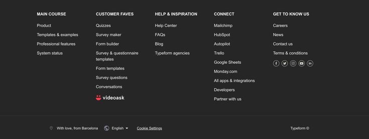
The Footer Navigation Menu is a navigational element located at the bottom of a webpage, typically within the footer section. It contains links to important pages or sections of the website, offering users additional navigation options beyond the main menu. This menu often includes links to essential pages such as contact information, privacy policy, terms of service, and sitemap. Footer navigation menus contribute to user experience by providing easy access to key information regardless of where users are on the webpage. Additionally, they can improve SEO by enhancing website crawlability and ensuring all pages are accessible to search engine bots.

Conclusion
In conclusion, website navigation plays a crucial role in user experience and website success. By understanding the different types of website navigation, including horizontal bars, dropdown menus, hamburger menus, sidebar navigation, and footer menus, website owners can create intuitive and user-friendly navigation systems. Each type has its advantages and best use cases, catering to different design preferences and user needs. Regardless of the choice, prioritizing clear organization, ease of use, and accessibility ensures that visitors can navigate the website efficiently, leading to higher engagement, better retention, and ultimately, a more successful online presence.
Read More How to Build Your Website Architecture for SEO Best SEO company in san diego
FAQ’S
Why is website navigation important?
Effective navigation enhances user experience, improves engagement, and helps visitors find information quickly and easily.
What role does website navigation play in SEO?
Website navigation impacts SEO by helping search engines understand your site structure, facilitating crawling and indexing, and improving user engagement metrics.


